On Slight Hinting, Proper Text Rendering, Stem Darkening and LCD Filters
This article was originally written for the 2.6.2 release of FreeType and explains the technical background of several features. The information was deemed useful enough to be added to the documentation and has therefore been retitled.
FreeType 2.6.2 ships with three interesting details for users and developers of rendering libraries that deal with text.
- (S)light hinting invokes the native hinter if possible
- Experimental: Stem darkening for the auto-hinter
-
Disabled
stem darkening for the autohinter and Adobe’s CFF
(
.otf) engine - The default LCD filter for subpixel rendering has been changed
(S)light hinting invokes the native hinter if possible
In the past, setting ‘slight’ hinting via FontConfig or configuration GUIs meant that native hints within a font were ignored; FreeType’s auto-hinter would analyze the font on the fly and automatically do what the font designer would have to do at least semi-manually. Technically, the auto-hinter set to (s)light snaps glyphs to the pixel grid only vertically, just like Adobe’s proprietary font engine and in a certain way also Microsoft’s ClearType/DirectWrite. The result is a compromise between design fidelity and sharpness that preserves inter-glyph spacing, something very important for horizontal text such as what you are reading right now. The sharpness has usually been enhanced with ‘subpixel rendering’ (ClearType on Windows), exploiting the physical properties of modern but low-resolution LCD panels.
This worked out well so far, Ubuntu has been using this setting for every font for years now. Werner Lemberg is adding support for more and more scripts and has also spun off the code into ttfautohint, to help font designers ease the pain of manual hinting.
This also meant that the native hinting machinery of the
font drivers went unused. Historically, this decision was
sound because the native hinting mechanics for Postscript
(.pfa, .pfb), TrueType
(.ttf) and OpenType/CFF (.otf)
were subpar for the longest time. The PostScript hinter
still is, but with Adobe’s high-quality OpenType/CFF
engine contributed to FreeType and recent advances of the
TrueType driver towards full ClearType support, things
have changed.
Setting ‘slight’ hinting usually leads
to FT_LOAD_TARGET_LIGHT. This mode implied
the auto-hinter before and has now been changed to mean
“Use native vertical-grid-only-snapping if driver and font
supports it and vertical-grid-only auto-hinter otherwise”.
Right now, only the OpenType/CFF driver is supported. In
the future, this will hopefully include the TrueType
engine once full support for ClearType arrives.
Technically, ClearType fonts can and will snap to the
vertical and the horizontal
grid depending
on several details, but the net result is going in the
direction we want.
This decision was driven by my personal whim; I wanted native vertical grid-fitting if the font driver and font supports it, and the auto-hinter otherwise. I assume that native hints are made more carefully and take the (auto-hinting) guesswork out of the process. Instead of introducing per-format configuration in FontConfig and fighting GTK/GNOME that only support a single global hinting setting, it was found to make more sense to change the definition of light hinting in FreeType.
I also hope this change will make it easier for the non-Windows-and-Apple ecosystem to switch over to slight hinting as the default. Current full/medium native hinting, as is the default, tends to bring out the worst in many, many fonts that haven’t seen the same insane dedication to on-screen display and hinting as many popular Microsoft fonts, for example. And since ClearType is still not fully supported, you usually get a very poor default experience. Slight hinting gives a much better one, as Ubuntu has proven over the years.
Experimental: Stem darkening for the auto-hinter
Stem darkening emboldens glyphs at smaller sizes to make
them more readable on common low-DPI screens. If this
sounds familiar to you, that’s because Adobe’s CFF engine
has been doing it since it was contributed in 2013. You
might have noticed that OpenType/CFF fonts (commonly
suffixed .otf) like GNOME 3’s default UI
font Cantarell
appear bolder and fuzzier than other fonts, at least until
this release. The auto-hinter can do the exact same thing
now, it is just disabled by default.
But why would you do this if small glyphs are already fairly readable? It turns out that font rendering in the Linux ecosystem has been wrong since scalable fonts were introduced to it. Text must be rendered with linear alpha blending and gamma correction, which no toolkit or rendering library does by default on X11, even though Qt5 and Skia (as used by Google Chrome and other browsers) can do it.
Background
First, to understand why they are required, you must know that when FreeType outputs a grayscale glyph image, it really outputs a coverage bitmap. If a pixel is completely covered by a filled-in outline, the pixel is made 100% black (0% brightness, which is simply black). If a pixel is only 50% covered, the pixel is made 50% black (50% brightness or a middle shade of gray) and 0% covered means 0% black (100% brightness or white). On high-DPI screens like on smartphones and tablets, the pixels are so small that the chance of being completely covered and therefore completely black is fairly good. On low-DPI screens most of us are sadly stuck with, the situation is different. The pixels are too large for most of the details of a glyph and shades of gray are the norm rather than the exception.
This is relevant because all our screens have a second problem: they are not linear. 1 + 1 is not 2. Twice the value does not result in twice the brightness. When a pixel is only 50% covered, the coverage map says 50% black, and this translates to a pixel value of 128 when you use 8 bits per channel (0-255). However, this does not translate to 50% brightness for that pixel on our sRGB and gamma 2.2 screens. Due to their non-linearity, they dwell longer in the darks and only a pixel value of about 186 results in 50% brightness – 128 ends up too dark on both bright and dark backgrounds. The net result is that dark text looks burnt-out, pixely and blotchy on bright background, bright text too frail on dark backgrounds, and colored text on colored background (for example, red on green) seems to have dark halos or ‘dirt’ around it. The situation is especially ugly for diagonal stems like in glyph ‘w’, where the quality of FreeType’s anti-aliasing depends on the correct display of grays. On high-DPI screens where smaller, fully black pixels reign supreme, this doesn’t matter, but on our low-DPI screens with all the gray shades, it does. 0% and 100% brightness are the same things in linear and non-linear space, just all the shades in-between are not.
The correct way of rendering a glyph image on a surface is to alpha blend it onto the surface in linear space and then apply gamma correction to translate the linear coverage map to something that is correct for our screens.1 No toolkit in the Linux ecosystem does it by default, even though Qt5 and Skia can and will do it on other platforms. Windows and Mac OS X do it natively. This procedure is especially important if glyphs should be subpixel-rendered (ClearType and Mac OS X) with as few color fringes as possible.
1 This process can cost performance. There is an approximation that does not need to know about the background color. See https://web.archive.org/web/20211019204945/https://bel.fi/alankila/lcd/ and https://web.archive.org/web/20210812105407/https://bel.fi/alankila/lcd/alpcor.html for details. There is a proof-of-concept pixman hack for cairo.
Back to stem darkening
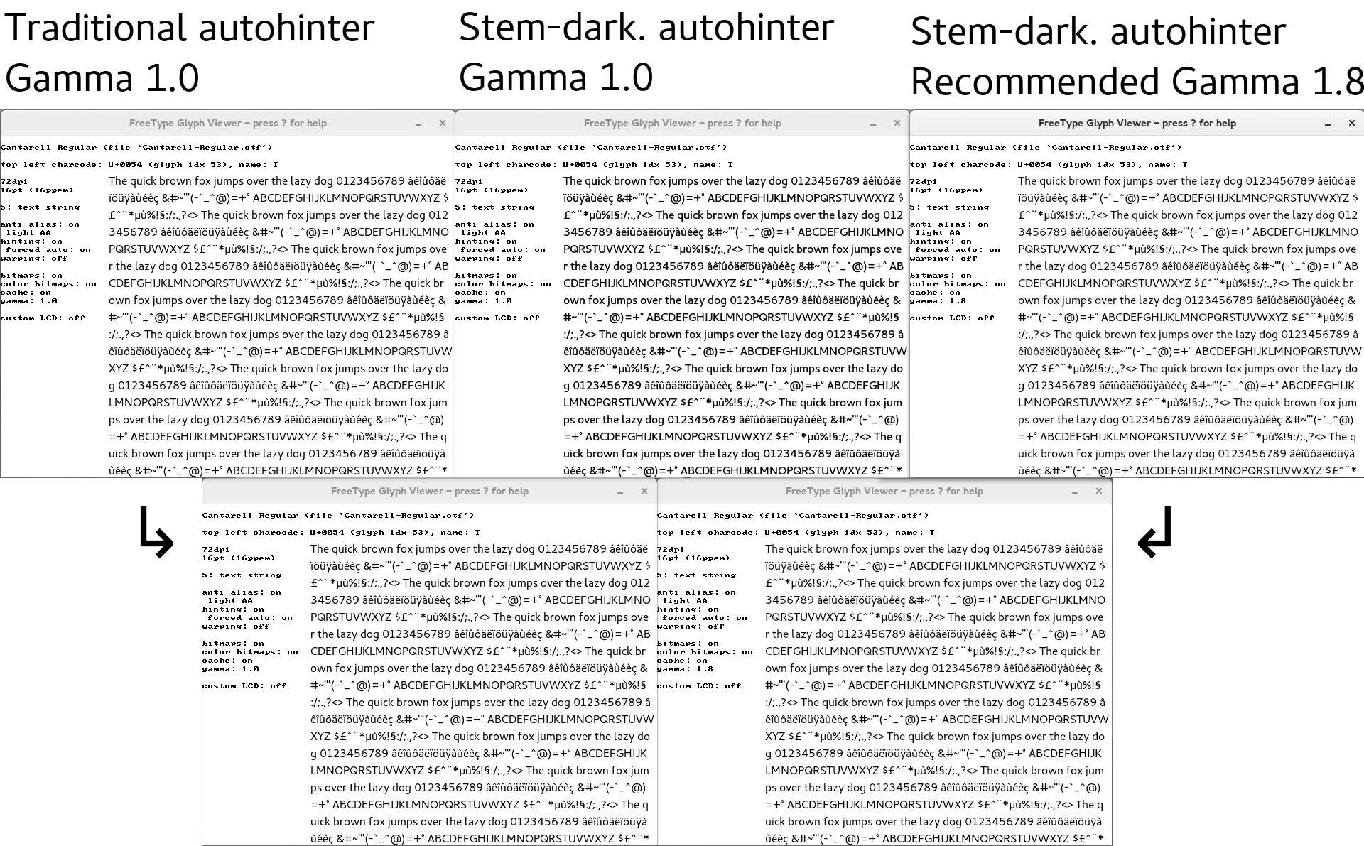
Assume we render fonts correctly. Gamma correction essentially lightens fonts since shades of gray are shifted to higher pixel values (corresponding to higher brightness) to match the original intention to the reality of our screens. The side-effect is that glyphs that were rendered incorrectly but fairly readable suddenly thin out. Correctly rendered but hard-to-read text doesn’t do anyone a favor. So Mac OS X and Adobe’s proprietary font engine implement a counter-measure: stem darkening at smaller sizes where shades of gray dominate. By emboldening a glyph slightly in relation to its pixel size, individual pixels get higher coverage of filled-in outlines and are therefore blacker. This increases contrast and prevents thinning out of glyphs. Text remains readable at smaller sizes.

“Gamma 1.0” shows what happens when you take a grayscale coverage bitmap from FreeType and blend it onto a surface in linear space. Black-on-white is heavier than white-on-black and red-on-green has dark halos or dirt around it. Note that this picture is unrealistic in the sense that no rendering system on X11 does linear alpha blending, so imagine something worse. “Gamma 1.8” is the result of linear alpha blending and gamma correction. It is much better, but text thins out, making it harder to read. Adding stem darkening gets us to “Gamma 1.8, darkened”. Note how it is the cleanest rendering of all. “Gamma 1.0, darkened”, meaning linear alpha blending without gamma correction but with stem darkening, exaggerates the effects of “Gamma 1.0”. Stem darkening should only be enabled when doing gamma correction, so ideally it should always be done.

The autohinter has a new toggleable stem darkening property that works like the stem darkener in Adobe’s CFF engine. Note how it makes text slightly bolder with the default parameters, down to small pixel sizes. Gamma correction is active to demonstrate the thinning out of text especially at smaller pixel sizes with lots of gray pixels.
And that is the story behind this feature.
Disabled
stem darkening for the autohinter and Adobe’s CFF
(.otf) engine
No library supports linear alpha blending and gamma correction out of the box on X11. Turning on stem darkening leads to heavy and fuzzy looking glyphs as in “Gamma 1.0, darkened” above, so it’s better to disable it.
Qt5 actually had gamma correction enabled for a short time while until someone complained that text was too light and unlike rendering in other toolkits, so the maintainers disabled it for the XCB-backend. Skia (Chrome) can do gamma-correction, but turns it off for X11.
I see autohinter stem darkening as a technology preview
for playing around with until we get stem darkening
generic within FreeType. The plan is to provide it for
all font drivers and make it toggleable
per FT_Library just like
FT_Library_SetLcdFilter. Libraries that
support linear alpha blending and gamma correction can
then just flip the switch and get appropriate glyphs no
matter the font.
A notable side-effect of disabling all stem darkening by
default is that natively hinted .otf fonts
will render remarkably similar to the auto-hinter and are
no longer heavy and fuzzy. Slight hinting will result in
consistent font rendering.
The default LCD filter for subpixel rendering has been changed
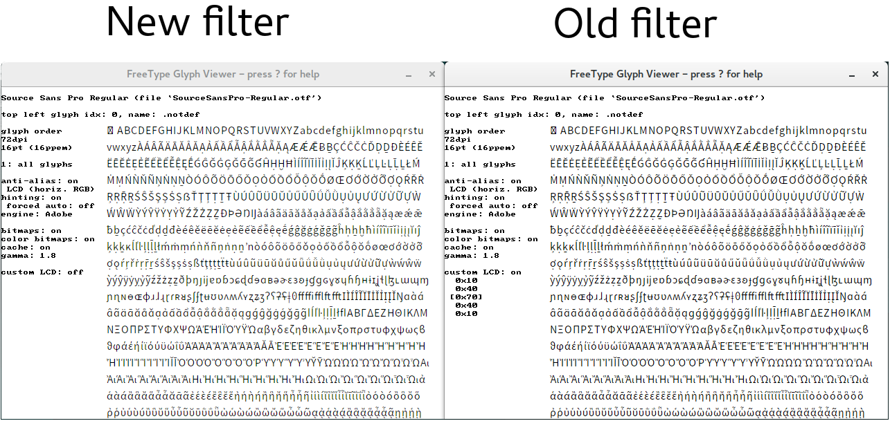
When you look at subpixel-rendered text, no matter whether it is on some kind of Unix, Windows, or Mac OS X, you might notice that it is slightly colored. Using subpixel rendering on LCD panels is a trade-off; you get three times higher resolution in the direction of the pixel-substripe (usually horizontal RGB) in exchange for color artifacts, also called color fringes. For this reason it is necessary to filter a subpixel-rendered glyph to reduce those color fringes before putting it somewhere on the screen. The filter distributes the values of a subpixel to its neighbors, sacrificing some of the higher resolution and making the resulting glyph image blurrier, but the positioning improvement remains! The ideal filter for you depends on your screen (gamma curves), the capabilities of the rendering system (linear alpha blending and gamma correction), your vision and your taste, probably in that order.
A filter should have two properties: it should be normalized, meaning the values used in the filter should sum up to a figurative 1 (here: 0x100 or 256) and it should be color-balanced, meaning that values for one subpixel are equally distributed to all other subpixels of a pixel to sacrifice some of the higher resolution to drastically reduce color fringes.
Previously, FreeType’s default LCD filter was neither normalized nor color-balanced. That was a deliberate choice because there is still no rendering system on Unix-like operating systems that does linear alpha blending and gamma correction by default to render glyphs correctly. Going above a filter sum of 1 increased contrast somewhat at the expense of slight distortions and increased color-fringing, so this can be seen as a hack. You might have noticed that thumbnails in various places on your computer that show text could be quite colorful. Now you know why.
The new default filter is both normalized and color-balanced. It is indeed ever so slightly blurrier than the previous default one, but also lacks its harshness and is less color-happy. The blurriness also means higher tolerance for non-ideal screen gamma (viewing angles) and rendering systems without linear alpha blending. Note that color fringes can only be really minimized when the rendering system will do linear alpha blending of text.
The ‘light’ filter that has accompanied the default one for so long stays unchanged: it already is normalized and color-balanced. It is sharper than the default one but less tolerant of uncalibrated screens and rendering systems without linear alpha blending, producing more color fringes.
Last update: 13-Feb-2018